How to Choose the Right Size and Font for Your Melbourne 3D Letters
When planning eye-catching signs for your business or personal brand in Melbourne, nothing stands out more than bold and beautifully designed 3D letters. Whether for your storefront, an office, or a special occasion, choosing the right 3D letters can really make your message pop.
But with lots of options to choose from, how do you pick the best size and font for your 3D letters in Melbourne? Let’s dive into some simple steps to help you decide the best features for your 3-dimensional letters that will catch the eye and leave a lasting impression.
Importance of Size
First, let’s talk about the size of your letters. Size is key for making sure people can see and read your message easily. Think about where these letters will go.
Will they be on a busy street where both walkers and drivers need to see them quickly? Or are they going indoors in a large room where you want to motivate and attract people?
Finding the Perfect Fit
A good rule is to make sure the letters are big enough to be read from the far end of where your audience will be. However, they should not be so huge that they don’t fit the space or look out of place. You need to find the perfect middle ground.
Selecting the Best Font
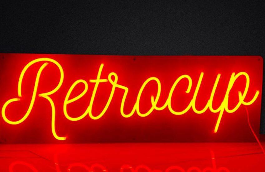
Next, let’s choose a font, which is basically the style of your text. The font shapes the feel and the message of your text. With 3-dimensional letters, you can be bold and pick complex styles since the added depth helps with readability.
Clarity is Key
While fancier fonts might look nice, it’s crucial that everyone can understand your message quickly. Fonts with simple lines and open shapes are great because they are easy to read from a distance. For example, Arial, Verdana, and Helvetica are popular because they are clear and simple.
Show Your Style
That doesn’t mean you can only use simple styles. If your brand is fun and quirky, you can try fonts that are rounder or have unique designs—just make sure they are still easy to read.
Consider Material and Finish
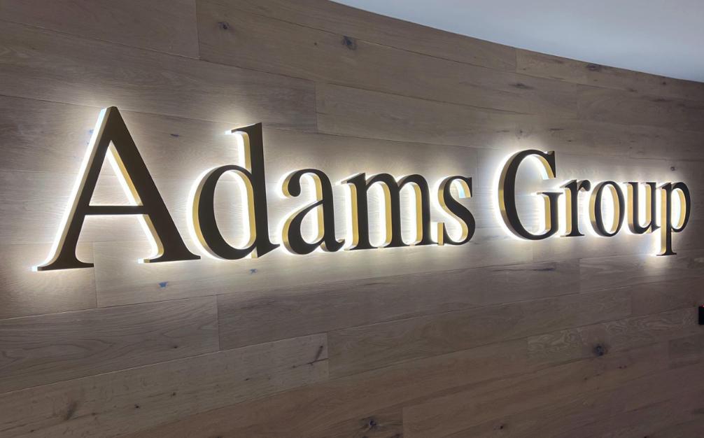
Finally, think about what your letters are made of and their finish. A shiny finish can help your letters stand out at night, while a matte finish might look more professional during the day. The material and finish should match your size and font and look good all together.
Putting It All Together
Picking the right size and font for your letters is more about making a connection than just looking good. Your letters should grab people’s attention and make them feel something special. They should blend into their surroundings but also stand out to draw eyes.
Remember, the key is for your 3- letters to fit well with their environment, whether it’s a lively Melbourne street or a classy office. Balance readability and impact, and you’ll create not just a sign, but a memorable part of your brand.
Whether you’re promoting your business, celebrating something big, or just want to say something in a big way, carefully choosing the size and font of your 3D letters in Melbourne can turn a simple idea into a powerful visual statement.